The creative also needs to appeal both to local buyers and to the Chinese market, with all the collateral produced in English and also converted and redesigned into Mandarin.
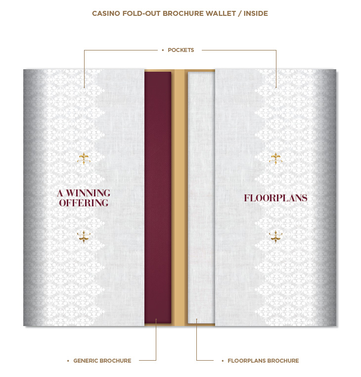
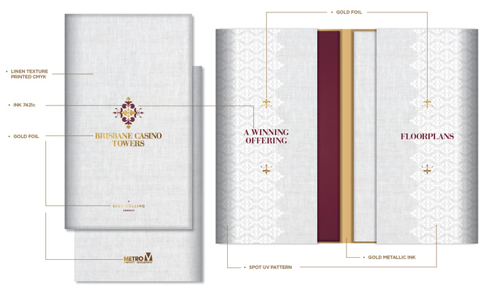
The choice of thematic colours – the rich deep crimson and gold – echo the colours regarded as fortunate in Chinese culture and also had a clear correlation with the project’s naming association with casinos and the images they conjure of velvet, jewellery and wealth.
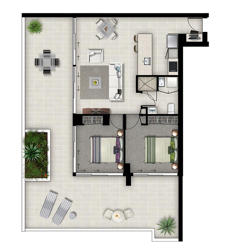
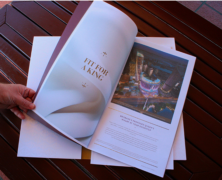
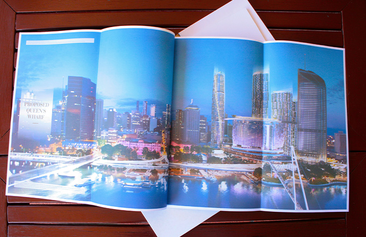
The photography and images reflected this, with an added inflection of playfulness, relaxation, indulgence and pampering. Our team also generated the floorplan illustrations that are so essential to attracting a high volume of advance off-the-plan sales.
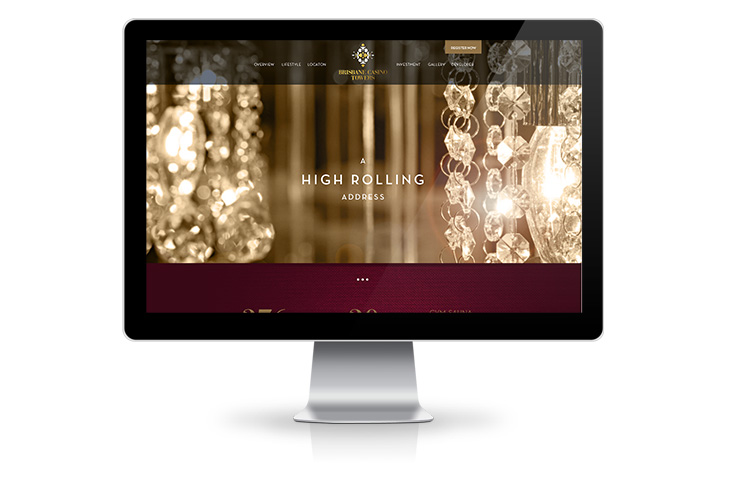
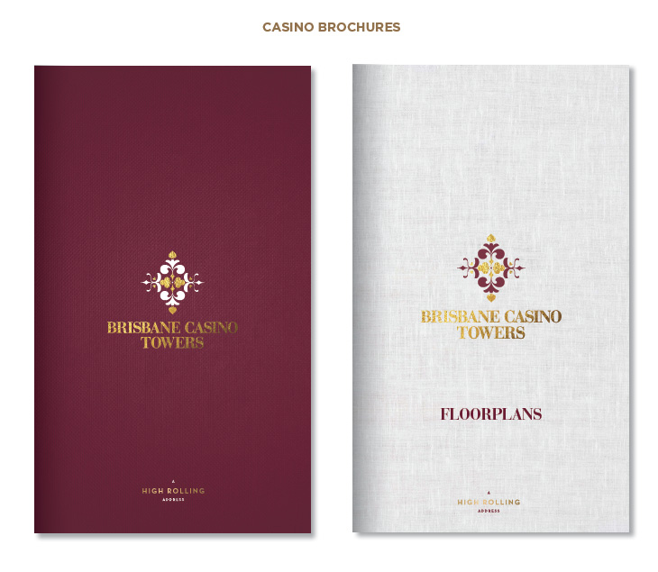
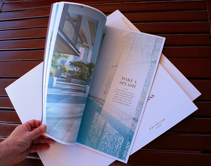
The brochure for the project in its custom-made folder with its textured feel lent weight and veracity to the project marketing, as did the Agent Sales Kits and very upmarket website design.
The Place Report for the June 2015 Quarter validated the strength of the creative and marketing package, stating, “Brisbane Casino Towers, was the top performing project in the Inner South [for that quarter] recording 102 unconditional transactions.”
The project is now sold out.
